FEATURES
Everything you need to complete a product page
Planning, design, copy, images, export—all in one place instead of using separate tools.
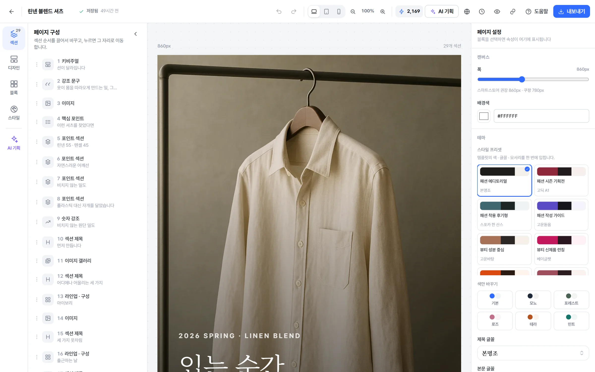
AI PLANNING
Decide what to show and in what order first
It's not just about making a pretty page—it's about building a page that sells. Arrange sections to address the buyer’s questions in the order they arise as they scroll.
- 01 Conversion flow by category Size for fashion, ingredients for beauty, comparison tables for electronics. Different orders are applied per category.
- 02 Proactively address objections Identify 3–5 buyer concerns and resolve them first with FAQ and info blocks.
- 03 Provide supporting evidence We explain why each order is chosen, so you know exactly what to adjust when editing.
- 04 No false information Leave placeholders for numbers, certifications, or effects not in the brief—don’t make them up.
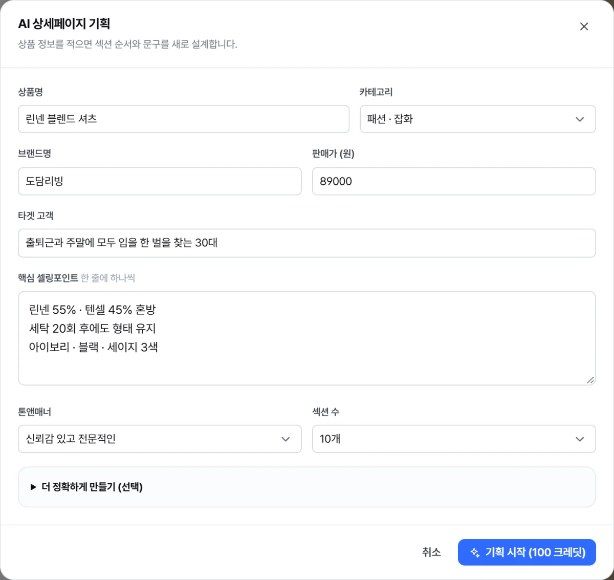

BLOCKS
Product page-only blocks: 28
No need to draw tables or find icons every time in a generic design tool. We’ve prepared blocks just for commerce, like product disclosure, size charts, and shipping info.
The image below depicts the actual blocks of the template.
Structure
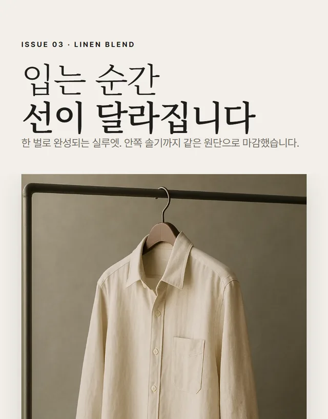
Hero
Hero image and headline to capture attention

Section title
Section titles and subtitles
Divider — Divider line· Spacing — Spacing between blocks
Content

Body
Description paragraph. You can adjust font size and line spacing.

Key points
List advantages with check icons. Add a box to make it a recommended card.

Highlight
Large text for key message

Feature card
Grid of icon + title + description cards
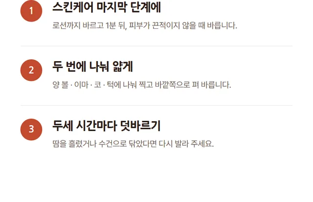
How to use
Step-by-step guide with numbers
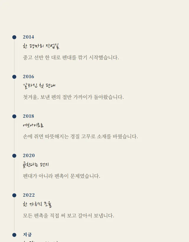
Brand story
Brand story by year or stage

Highlight section
Label, two-line title, description, and large image as a set. The basic unit of a product page body.
Media

Image
Single image. Caption and rounded corners supported.
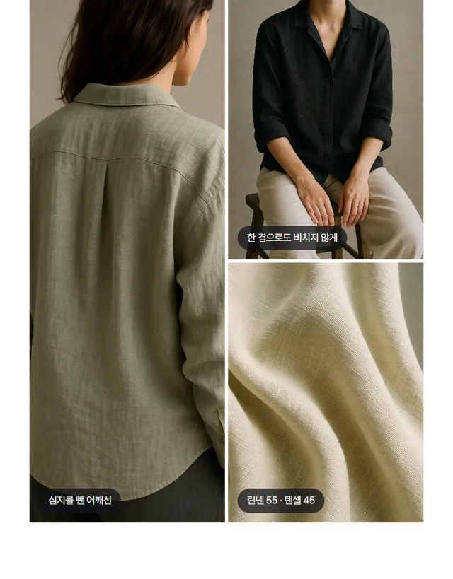
Image gallery
Multiple images in a 2–4 column grid
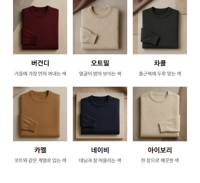
Lineup · configuration
Photo, name, and description card. Display ingredients, color options, or components side by side.
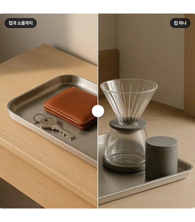
Before & after
Compare before and after by overlapping two photos.

Video / GIF
Autoplay video or GIF
Annotated photo — Add labels and descriptions to specific parts of a product photo. Use this to show materials, structure, or ingredients.
Persuasion
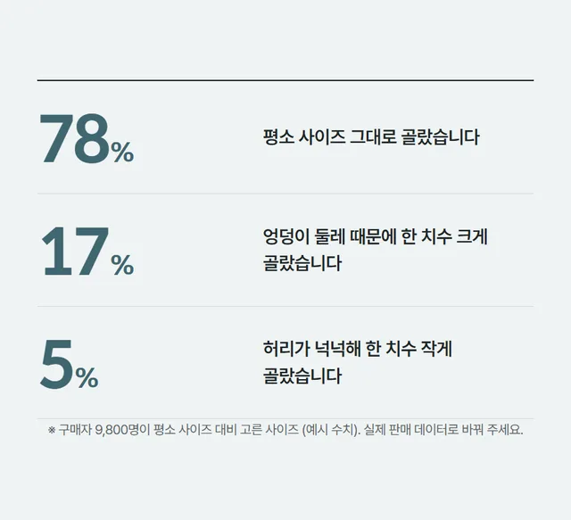
Number highlight
Highlight key numbers like sales or repurchase rate
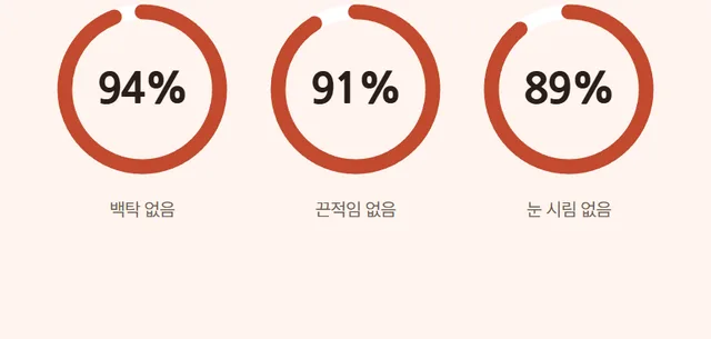
Graph metrics
Compare values with bar or pie charts.

Customer review
Customer review with star rating
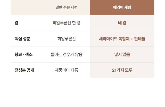
Comparison table
Competitor comparison by feature

Certification / Award
Test reports & award badges
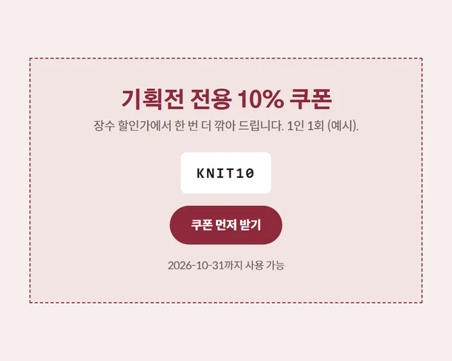
Coupons & offers
Discount coupon and gift offer info
Product details
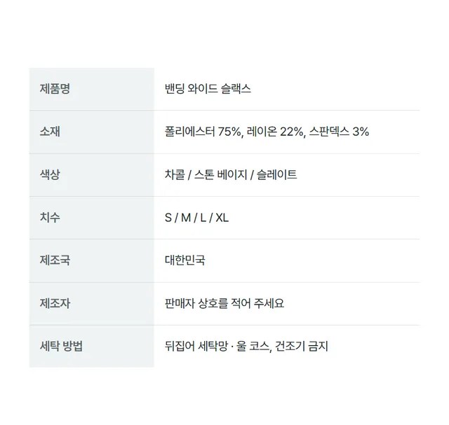
Product details
Product disclosure: material, volume, manufacturer, etc.
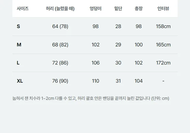
Size chart
Measured size chart by option
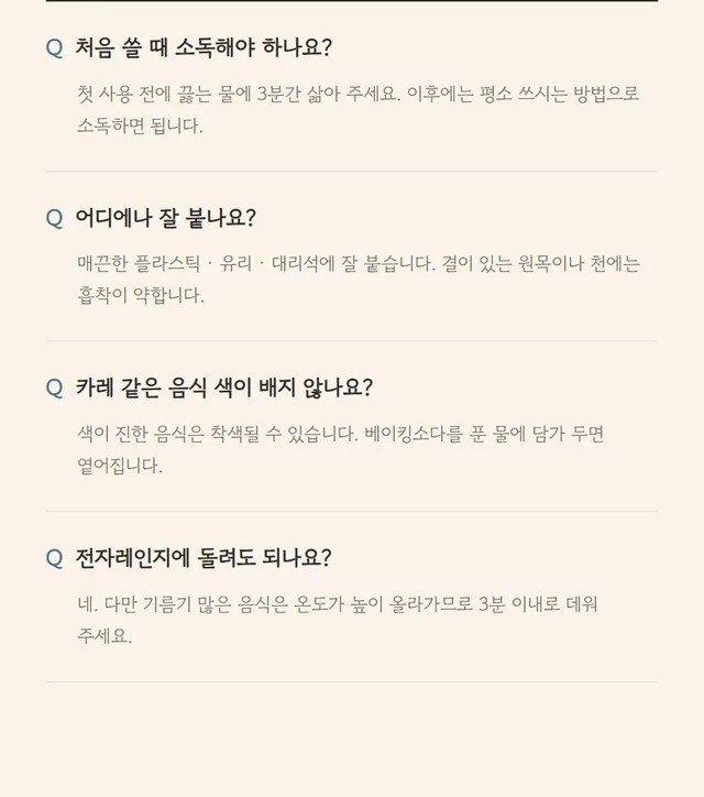
Frequently asked questions
Q&A to address pre-purchase concerns

Shipping & returns
Shipping, exchange & return policy
Closing

Call to action
Final banner to encourage purchase
EDITOR
Edit in a familiar way
Section list on the left, canvas in the center, properties on the right. If you’ve used a design tool, you’ll know what to do.
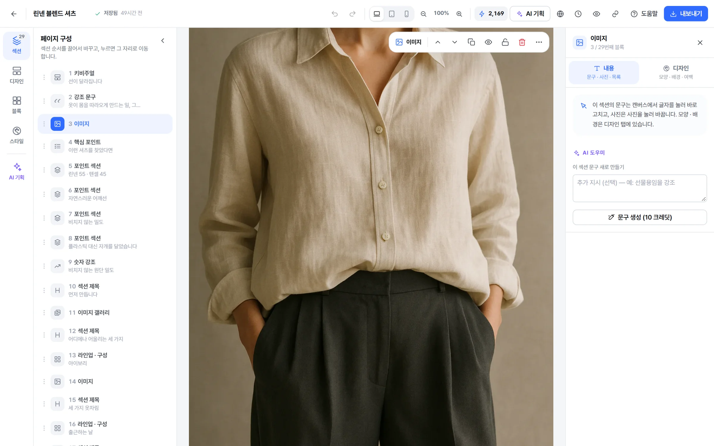
- 1 Edit directly on the canvas Click text to edit it in place—no separate input window needed.
- 2 Insert a section where you want Click the + on the section boundary to choose a design section to insert there.
- 3 Drag to reorder Drag blocks in the section panel to change order. The canvas updates instantly.
- 4 50 undo steps Undo with Ctrl+Z, redo with Ctrl+Shift+Z.
- 5 Auto-save and versions Auto-saves when you stop editing, and lets you name and save key versions.
- 6 Mobile preview Most buyers view on mobile. Instantly check your page at different widths.

Design section
Preview and insert complete sections from templates using your page's colors and fonts.
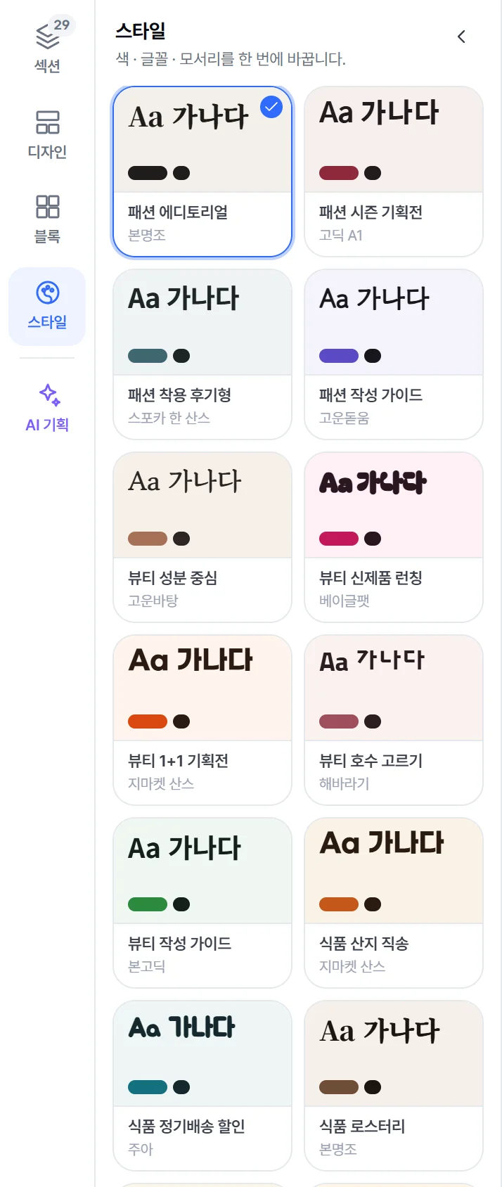
Change style at once
Apply color, font, and corner styles with one card, and undo if you don't like it.

Property panel separating content and design
Edit text and photos in the Content tab, and shapes, margins, and backgrounds in the Design tab.
EXPORT
Automatically split to fit channel specs.
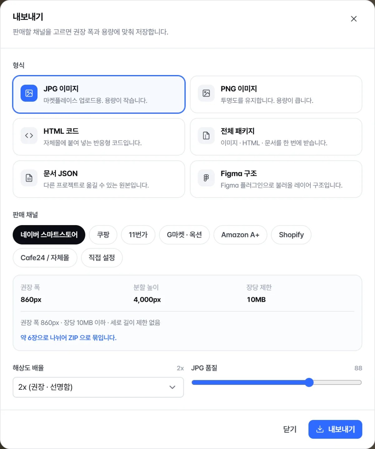
Each channel has its own recommended width and file size limit per image. Select a preset to auto-split long images and add sequence numbers to filenames.
| Channel | Recommended width | Split height | Per image limit |
|---|---|---|---|
| Naver Smart Store | 860px | 4,000px | 10MB |
| Coupang | 780px | 3,000px | 5MB |
| 11st | 800px | No split | 10MB |
| Gmarket · Auction | 860px | 4,000px | 10MB |
| Amazon A+ | 970px | 600px | 2MB |
| Shopify | 1200px | 4,000px | 20MB |
| Cafe24 / Own store | 1000px | No split | 20MB |
| Custom | 860px | No split | 20MB |
- PNG image
- High-quality image with transparency. Supports split download.
- JPG image
- Small file size, ideal for marketplace uploads.
- WebP image
- Smaller file size than JPG at the same quality. Suitable for your own store and Cafe24.
- PDF document
- Use this to send to partners, photo teams, or for printing.
- HTML code
- Responsive HTML with inline CSS. Ready for your own store.
- Full package (ZIP)
- Download images, HTML, assets, and documents all at once.
- Document JSON
- Original document for use in other projects.
- Figma import JSON
- Layered file for Figma plugin import.

It's faster to try than to explain.
Start right away without a credit card. Your first product page is free.